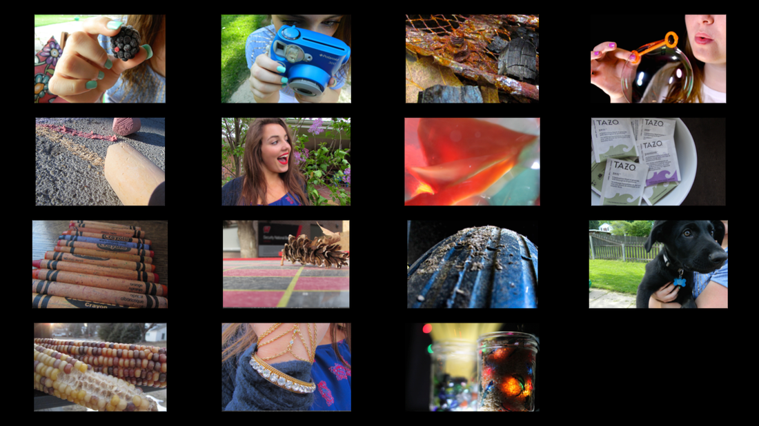
Overall, I can see that Kaya has a similar style as me. She takes pictures of things with a lot of color and also takes them up close. My favorite photos are the chalk, puppy, and the 6th one with her friend wearing lipstick. I like the chalk one because it has really cool texture and shows a lot of depth. The puppy one I like mainly because the puppy is really cute but also because I like how the blue tag stands out with its black fur. Finally, I like the one with her friend wearing lipstick because the bright red lipstick really stands out. I also like her facial expression, in that she looks very happy. The compositional elements I can see in her photos are: rule of thirds, texture, repetition with variety, value, and leading lines. I feel she does a very good job presenting all in these 15 photographs. The thing I feel she's missing in her portfolio is the lightning. Especially in the corn one, I feel it would be even cooler if it was shot outside on a sunny day and you can clearly see the definitions in it. I don't feel there's anything too repetitive because I feel she gives a good variety of photos that are mostly different from eachother. Overall, I feel these photos are great and I can tell she understands the compositions we learned in Photo One.
I chose these photos because I feel it shows the type of photographer I am. I really like to shoot objects up close and with unique angles. I also like color and use that to draw peoples' attention to the main focal point. My favorite photos this semester is my still life with the ice cream facing down, also I like the second formal portrait of my friend Katya while she is wearing mud on her face, finally I like the second informal portrait where I focused on Ande's face up close. I like that particular ice cream photo, because it shows a lot of colors while still seeing the texture of the ice cream cone. I also like how your eye goes straight towards the mess of ice cream and cone because I edited the background to make it blacker. I like Katya's photo because I like how hair is and how she is running her finger through it. Overall, I just really enjoy how she looks in the mud. She did very well when I shot her for formal portraits. Ande's photo I mainly like because of how the wind blew her hair. That along with her facial expression, both really make this picture cool. I tried to choose photos from a variety of different units, so it could show that I used all the compositional elements. I feel rule of thirds, leading lines, repetition with variety, value, and texture are all displayed in these photos. The thing I'm missing is the mix between up-close and also farther-back photos. Although I really like zooming up on photos, what I want to work on next year in photo 2 is moving back and getting a good picture that way. Also like I just said, the thing that's too repetitive is the closeness of the photos. Overall, my favorite assignment was the formal portraits. I had a lot of fun with playing around with different props and features in the dark room. I also was very lucky to have a photogenic friend. However I'd love to continue to shoot not only portraits but other photos outside of school because I've very much have enjoyed this class. My theme was outdoors. I went to a couple different places to get this. I first went downtown. I then went around my house and filled the compositions I didn't have. For my first photo, I feel leading lines was the composition used the most predominant. This is because the pole leads to the spiral object. Overall, there are just a lot of lines going into and out of this photo. I shot this photo at a place at UNO. I felt if I shot the whole sculpture, it would be too distractive because a lot was going on. So I chose to shoot a fraction of it, and emphasis certain spots. This along with the sun shining, is why I feel this photo is the most creative out of all. The second photo, I feel value shows through the best. This is because, the white grass is totally opposite from the dark-green grass. They both balance each other out. Also, the bright blue letters in the background also add a different tone of color which also counterbalance the white and green grass. This is an old building downtown that I thought would be cool to offset the natural colors with bright neon colors. The third photo is from my backyard. Rule of thirds is a good composition to fit this, but also leading lines. The rule of thirds is shown with the pink flowers offset in the background. I could've made them in the center, however, I didn't feel like the photo would be very interesting. I can somewhat also see leading lines because of the lines in the fence. The reason I like this photo isn't only because of the angle, but also the blur is where I like it. Next, the fourth photo, is probably my least favorite. However, I think it fits texture well. You can tell the sidewalk is rough and rocky. I also like the light in this photo. The sun was beginning to set and allowed for this photo to have great lighting. This next photo is also around my house. I used a similar concept as the other grass photo but I edited this differently. I wanted to decrease the saturation so you can't really pick out the colors but the color tones, and how one is way darker than the other. That's why this photo also shows value well. The sixth photo is also in a different angle. I feel this shows texture well also. The rough bark, I feel offsets the cool, blue sky in the background. The one piece of bark that stuck out, and made it to be the focal point of this photo. The seventh photo, which I took downtown, instantly reminded me of repetition with variety. As I walked around the corner, I saw red, and blue chairs and then a bright yellow one that stood out. It also recently rained, so the water on the chairs create a cool glare to the photo. While editing, I also wanted to dim down the saturation, so you can't necessarily see the colors well but the color tones. Finally, my last photo shows texture well. I liked the discolored wood that was worn compared to the bright green paint still present on some of the bench. I also like the angle of it, and how 2 boards are the focal point while others are in the background. ISO:
-How sensitive the camera is to the light -Numbering scale -Like sunglasses -100, 200, 400, 800, 1600, 3200 -Lower the number, the more sensitive to light it is (Use 80-200 on sunny day) -Higher the number, the less sensitive it is to light (Use 800-3200 on dark/nighttime) Aperture (F-Stop): - How much light is taken in -Like pupil of eye -Higher the number, smaller the opening=greater range of focus -Smaller the number, the bigger the opening=decreased range of focus -Controls depth/range of field -Blurs in photos -Wide Aperture Lens- curved to get blurs in photo Shutter Speed: -Unit of measurement -Length of time the shutter is open -Lower the shutter speed the less time shutter is open, light, motion affects it the least -Higher the shutter speed the more time the shutter is open, motion, and light effects the photo greatly -Measured in fractions of seconds or whole seconds To take these photos, we had to change a couple adjustments on the camera. The biggest one was the shutter speed. We had to length this so we could capture all the movement of everyone. We did 4 different shutter speeds: 2, 5, 8, and 13. We found that 5 and 8 worked the best. This was because the amount of motion it caught during these seconds was the right amount to offset the still people. We also had to use a tripod and set up in spot that was high up and could get the whole landing. The spot we chose, which was in the math imc, I felt was a good spot to do this motion photography. For my informals, I chose to photograph my friend Ande, which we did before one of our softball practices by railroad tracks, which was behind our indoor practice facility. In the photos, she used different softball equipment. For the first one, I really wanted a serious, upclose photo that shows what kind of softball player she is. I feel through her lips and body language, you can tell she is serious about softball and a good player. However through her eyes the intensity is decreased. The second photo I really liked the industrial look of the trains offset by the clean-cut, modern softball player. My third photo, I really wanted to show her red glove which is a different color than most. The fourth photo I wanted to also capture the trains in the background and also the neon color of the ball. For the fifth picture, the messy hair and upclose shot I felt looked really cool together. Finally, my sixth shot, the wind was heavily blowing and by her sticking her bat out and her hair blowing, really makes her face look great. I liked that I chose to shoot on a rainy, cold day because it showed that you can take photos anywhere and anyplace and still make them look great. I chose to use my friend Katya as my model. I got one of my ideas from pinterest. It was to blow confetti/glitter at the camera while she is still looking at the camera. My other idea I thought of because I wanted her to look like a fierce soccer player. I thought the mud would complement her emotion on her face well. The mud worked very well I felt. I thought it looked really cool and she handled it well also. What didn't work so well was the confetti. It was hard to capture her looking at the camera all while getting that perfect angle and positioning of the confetti. So I only found one good picture that I felt suited all them well. I chose these four photos because I felt it showed two sides of her: an intense high school soccer player, and also a regular teenage girl. I also chose them because they all are different from each other. For this blog we had to photograph strangers. At first I was very nervous because I'm not an outgoing person and it's hard for me to talk to new people. However, once I approached a table of older women, they were very welcoming and open to the idea as I further explained it. It was a little difficult because they were sitting down so posing was different. Along with this, I feel next time I should tell them to just be themselves and not have a smile that looks forced, because although I like how these pictures came out, I would've liked them to be unique to them and I feel I could've captured that through them being candid. Overall, I was happy doing this assignment because it opened up my options for who I can take portraits of in the near future, I learned a lot from it. In my selfies I didn't only want to capture my whole body, but also just my feet and hands. In the first photo, I really liked the texture on my shoe and and it was a different photo for a portrait. Although it may not be a true definition of a portrait, I still like what it's capturing. In my second photo, I set the self timer on the camera and I wanted a cool and different angle so I stood over the camera. It took me a couple tries to get it how I wanted it, but overall i feel this photo shows my style of photography well. My third I had a lot of homework that night so I chose to take the book I was reading and use my hands to make it look as if I were "skimming" through it. It probably isn't my favorite photo but overall for the time I had that night, it turned out the best out of the ones I did take. My fourth photo I wanted to do a motion one, so I set the self timer and ran over to the spot and threw a ball up in the air. This way was very tricky because between the timer and the position I had to run, it was tough. For if I do something like this in the studio, it will be a lot easier photographing someone and I can control when the picture is taken and also I can position the person. My fifth photo I chose to shoot my hand holding a ball. I like the simplicity in this photo, yet it still has depth. Again, I wanted to capture not my whole body but just a part of it. I had fun doing my still lifes because it was a big mess. However I liked how some turned out. In the first picture, this was my first vision of having a simple white ice cream and cone and have bright paint dripped over the top. It's a very different idea and I feel that's where the creativity comes from for all 4 of the pictures. The compositions used in the first is the rule of thirds, and color. The ice cream is offset to the right corner to where it's considered rule of thirds. The color leads the eye straight to the blue and sprinkles because that's the pop of color that's so different in this picture. The second picture is the new idea that I wasn't anticipating on, but turned out very cool and different, which was the cone turned upside down. What makes this picture cool is that the angle I used and the focus is on the simple as to the big mess and complex subject in the background. The composition I used was texture. In the third picture the angle also gave it a different view. I feel the background helped the ice cream because it was so black, that it made it pop out even more. The compositional pieces used were texture, and symmetry from the paint on the bottom. Finally the last picture, I mostly like this one from the reflection on the bottom. The blur in the front also adds a nice feature to the photo. The compositions I used were texture, lighting, and the focus. Overall, my process of finding this idea came to me from pinterest where I found a simple picture of a hand holding a melting ice cream cone and I wanted to take that idea and add a spin to it. It then eventually turned into turning the ice cream upside down and creating a mess, but a it turned out to very cool I feel. |